
Web design began in the early 1990s with the advent of the World Wide Web. Initial websites were simple, text-based, and lacked visual appeal.
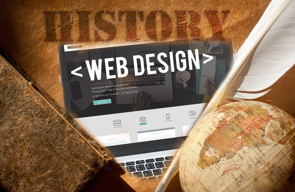
The history of web design is a journey through technological advancements and creative innovation. In the early 1990s, Tim Berners-Lee created the first website, which was purely informational and text-heavy. With the introduction of HTML, designers gained the ability to add images and hyperlinks.
By the late 1990s, CSS emerged, allowing for greater design flexibility and the separation of content from style. The 2000s saw the rise of Flash, enabling more interactive and multimedia-rich sites. Today, responsive design and user experience are at the forefront, ensuring websites are accessible across various devices and screen sizes.

Credit: www.behance.net
➡️ Early Beginnings
The history of web design dates back to the early 1990s. Web design began as a simple, text-based interface and has evolved into the visually rich and interactive experience we see today. The early beginnings were marked by the creation of the first websites and the emergence of HTML.
First Websites
The first websites were created in the early 1990s. Tim Berners-Lee is credited with creating the first website in 1991. His website was basic and contained only text and hyperlinks. This early site was hosted at CERN, the European Organization for Nuclear Research.
These first websites had:
- Simple text
- Basic hyperlinks
- No images or multimedia
Here is a table showing the key milestones of the first websites:
| Year | Event |
|---|---|
| 1991 | First website by Tim Berners-Lee |
| 1993 | Launch of the Mosaic browser |
| 1994 | Introduction of the World Wide Web Consortium (W3C) |
The first websites were groundbreaking. They laid the foundation for the future of web design. They were simple yet powerful, proving that the web could be a valuable tool for sharing information.
Html Emergence
HTML (HyperText Markup Language) played a crucial role in the early beginnings of web design. It emerged as the standard language for creating web pages. Tim Berners-Lee also developed HTML to structure web content.
HTML allowed web designers to:
- Create headings and paragraphs
- Add links to other pages
- Include lists and tables
Here is a simple example of HTML code:
html
Welcome to My First Website
This is a paragraph.
HTML gave web designers the tools to structure their content. It was simple to learn and use. HTML’s simplicity made it accessible to many people, encouraging widespread adoption.
HTML continues to be the backbone of web design. It is constantly evolving, but its core principles remain the same. HTML’s emergence marked a significant milestone in the history of web design.
➡️ The 1990s Boom
The history of web design is a fascinating journey through time. The 1990s marked a significant period known as The 1990s Boom. During this decade, the internet became accessible to the general public. Web design saw rapid advancements, and the foundations of modern web design were laid. Let’s dive into some key aspects of this era.
Browser Wars
The 1990s Boom saw the emergence of the Browser Wars. Two major browsers, Netscape Navigator and Internet Explorer, dominated the market. These browsers competed fiercely for users, which led to rapid innovation in web design.
Some key points during the Browser Wars:
- Netscape released the first commercial browser in 1994.
- Microsoft launched Internet Explorer in 1995.
- Both browsers introduced unique features to attract users.
This competition spurred the development of HTML standards and CSS. Designers had to ensure their websites worked on both browsers. This period also saw the introduction of JavaScript, enabling interactive web pages. The Browser Wars pushed web design to new heights, setting the stage for future innovations.
Table-based Layouts
In the early days of web design, table-based layouts were the norm. Designers used HTML tables to arrange content on web pages. This method was both revolutionary and limiting.
Key characteristics of table-based layouts:
- Tables provided a way to create complex layouts.
- Designers could control the placement of text and images.
- It was challenging to maintain and update table-based designs.
Despite the challenges, table-based layouts were a significant step forward. They allowed for more visually appealing websites compared to plain text and images. The use of tables also led to the development of WYSIWYG editors like Dreamweaver, which simplified the design process. While not perfect, table-based layouts paved the way for more advanced techniques in web design.
➡️ Flash And Multimedia
The history of web design is fascinating, especially with the evolution of Flash and Multimedia. Flash once dominated the web with its interactive elements, animations, and rich multimedia content. It brought a new dimension to web design, making websites more engaging and visually appealing. Let’s delve into the rise of Flash and its impact on user experience.
Rise of Flash
Flash emerged in the late 1990s and quickly became a popular tool for web designers. It allowed the creation of interactive websites, which was a significant advancement over static HTML pages. Flash enabled designers to use animations, video, and sound, providing a more dynamic and engaging user experience.
Key features of Flash included:
- Animations: Flash made it easy to create moving graphics, which grabbed users’ attention.
- Interactive Elements: Designers could add buttons, menus, and other interactive features.
- Multimedia Integration: Flash supported video and audio, enhancing the storytelling aspect of web design.
Flash was integrated into browsers through plugins, making it accessible to most users. It was widely used for:
| Application | Description |
|---|---|
| Website Introductions | Flash intros captivated users with animations and sound. |
| Online Games | Flash enabled the creation of simple, fun web-based games. |
| Interactive Ads | Advertisers used Flash to create engaging and clickable ads. |
Flash’s ability to combine visuals, sound, and interactivity revolutionized web design during its peak.
Impact On User Experience
Flash significantly impacted user experience by making websites more engaging. Users enjoyed the interactive content that made browsing more fun and immersive. Flash’s animations and sounds kept users on websites longer, increasing engagement.
However, there were some challenges:
- Loading Time: Flash content often took longer to load, affecting user experience negatively.
- Browser Compatibility: Not all browsers supported Flash equally, leading to inconsistent user experiences.
- Accessibility Issues: Flash content was not always accessible to users with disabilities.
Despite these challenges, Flash played a crucial role in the evolution of web design. It pushed the boundaries of what websites could do, paving the way for modern web technologies.
Flash’s legacy lives on in the interactive and multimedia-rich websites we enjoy today. Its influence can be seen in the use of HTML5, CSS3, and JavaScript to create similar effects without the need for plugins.
➡️ CSS Revolution
The CSS Revolution marked a significant milestone in the history of web design. Before CSS, web design relied heavily on HTML for both structure and presentation. This led to cluttered code and limited styling options. With the advent of CSS, designers could separate content from design, making websites more accessible, flexible, and visually appealing. The introduction of CSS transformed the way websites were built and viewed, leading to cleaner code and more dynamic designs.
Separation of Content
The separation of content from design was a game-changer. Before CSS, HTML was responsible for both the structure and the appearance of a webpage. This dual role made the code messy and hard to manage. CSS allowed designers to move all styling rules to separate files, leaving HTML to focus solely on structure. This resulted in:
- Cleaner code: HTML files became shorter and easier to read.
- Better maintenance: Changes in design could be made in one CSS file without touching the HTML.
- Consistency: A single CSS file could style multiple pages, ensuring a uniform look.
Here is a simple example to illustrate the separation:
| HTML | CSS |
|---|---|
Welcome to My WebsiteThis is a sample paragraph.
|
h1 { |
In this example, the HTML focuses on content, while the CSS handles styling. This separation simplifies web development and enhances the user experience.
Styling Innovations
The CSS Revolution brought about numerous styling innovations. Designers could now create visually stunning websites without relying on images and tables. Some key innovations include:
- Flexbox and Grid: These layout models allow for complex designs that adapt to different screen sizes.
- Responsive Design: CSS media queries enable websites to look good on both desktops and mobile devices.
- Animations and Transitions: CSS3 introduced animations and transitions, adding dynamic effects without JavaScript.
Here are some examples of CSS innovations:
| Feature | Code Example |
|---|---|
| Flexbox |
.container { |
| Media Queries |
@media (max-width: 600px) { |
| Animations |
.box { |
These innovations made it easier to create visually appealing and responsive websites, enhancing both user experience and accessibility.
➡️ Web Standards Movement
The history of web design is fascinating. One pivotal era was the Web Standards Movement. This movement focused on creating consistent standards for web design. It aimed to make web pages accessible and functional across various browsers and devices.
W3c And Accessibility
The W3C (World Wide Web Consortium) played a crucial role in the Web Standards Movement. It established guidelines to ensure web accessibility. These guidelines are known as the Web Content Accessibility Guidelines (WCAG).
Accessibility is vital for users with disabilities. The W3C emphasizes that all users should have equal access to web content. Key aspects of web accessibility include:
- Text alternatives for non-text content
- Keyboard accessibility for users who can’t use a mouse
- Readable content with clear, simple language
- Adaptable content that can be presented in different ways
Let’s look at some WCAG guidelines in a table format:
| Guideline | Description |
|---|---|
| Perceivable | Information should be presented in ways users can perceive. |
| Operable | User interface components should be operable. |
| Understandable | Information and operation should be understandable. |
| Robust | Content should be robust enough to work with various technologies. |
The W3C’s focus on accessibility ensures that web design is inclusive. This means everyone can benefit from the web, regardless of their abilities.
Cross-browser Compatibility
Cross-browser compatibility is another critical aspect of the Web Standards Movement. It ensures that web pages function correctly across different web browsers. This was a significant challenge in the early days of web design.
Different browsers rendered web pages differently. This inconsistency led to a poor user experience. Web designers had to write multiple codes for different browsers. The Web Standards Movement aimed to solve this issue by promoting standardized coding practices.
Here are some key points for achieving cross-browser compatibility:
- Use standard HTML and CSS.
- Validate your code with W3C validation tools.
- Test your website on multiple browsers.
- Avoid using browser-specific features.
Let’s compare how different browsers handle web standards:
| Browser | Compatibility Level |
|---|---|
| Google Chrome | High |
| Mozilla Firefox | High |
| Internet Explorer | Low |
| Safari | Medium |
By following web standards, designers can ensure their websites work well across all browsers. This improves user experience and makes the web more accessible.
➡️ Responsive Design
Web design has come a long way since its early days. One key innovation is Responsive Design. This approach ensures websites work well on all devices. From desktops to smartphones, users have a seamless experience. Responsive design adapts to different screen sizes and orientations.
Mobile-first Approach
The Mobile-First Approach is a cornerstone of responsive design. Designers start by creating a site for mobile devices. Then, they scale it up for larger screens. This method ensures the site works well on the smallest screens first.
Here are some key points about the Mobile-First Approach:
- Improved User Experience: Small screens get the best attention. This makes the site easy to navigate on a phone or tablet.
- Better Performance: Mobile sites are often faster. They use fewer resources and load quickly.
- SEO Benefits: Google favors mobile-friendly sites. A mobile-first design can boost search engine rankings.
Designers use various techniques in the mobile-first approach:
- Simple Layouts: Start with a clean, minimal design. Add complexity for larger screens.
- Touch-Friendly Navigation: Ensure buttons and links are easy to tap.
- Responsive Images: Use images that adapt to different screen sizes.
Using the mobile-first approach ensures a website is accessible and user-friendly. It also prepares the site for future growth.
Fluid Grids
Fluid Grids are another key component of responsive design. Unlike fixed grids, fluid grids use relative units like percentages. This allows elements to resize based on the screen size.
Benefits of fluid grids include:
- Flexibility: Content adjusts to fit any screen size. This makes the site look good on all devices.
- Consistency: The layout remains consistent across devices. Users get the same experience whether on a phone or desktop.
- Easy Maintenance: Fluid grids simplify updates. Changes to one element affect the entire layout.
Designers implement fluid grids using CSS. Here’s a simple example:
.container {
  width: 100%;
  display: flex;
  flex-wrap: wrap;
}

.item {
  flex: 1 1 auto;
  margin: 10px;
}
In this example, the container takes up the full width of the screen. Each item inside the container adjusts its size based on the available space.
Fluid grids ensure a responsive and adaptive layout. This approach enhances user experience across different devices.
➡️ The Rise of Frameworks
The history of web design has evolved dramatically over the years. One pivotal moment was the rise of frameworks. These tools revolutionized the way developers built websites, making the process quicker and more efficient. Frameworks like Bootstrap and Foundation played a crucial role in this transformation.
Bootstrap and Foundation
Bootstrap and Foundation are two of the most popular web design frameworks. They provide pre-written code and components that help developers build websites faster. Here are some key features of both frameworks:
- Responsive Grid System: Both frameworks offer a grid system that makes it easy to create responsive designs.
- Pre-styled Components: Buttons, navigation bars, and forms are pre-styled, saving developers time.
- Customizable: Developers can customize the frameworks to fit the specific needs of their projects.
- Cross-browser Compatibility: Ensures that websites look good on all browsers.
Bootstrap, developed by Twitter, has a large community and extensive documentation. This makes it easier for beginners to learn and use. Foundation, created by Zurb, is known for its flexibility and advanced features. Both frameworks have their strengths, and the choice between them often depends on the specific needs of a project.
Streamlining Development
Frameworks like Bootstrap and Foundation streamline the development process. They provide a solid foundation, allowing developers to focus on the unique aspects of their projects. Here are some ways they make development easier:
- Consistent Design: Frameworks ensure that all elements of a website have a consistent look and feel.
- Time-saving: Pre-written code and components speed up the development process.
- Reduced Errors: Using a framework reduces the chance of coding errors.
- Community Support: Large communities offer support and resources for troubleshooting and learning.
Frameworks also enable developers to create prototypes quickly. This is especially useful in the early stages of a project. By using a framework, developers can focus on functionality and user experience, rather than spending time on basic design elements. This leads to faster development cycles and more efficient workflows.
Below is a table comparing some key aspects of Bootstrap and Foundation:
| Feature | Bootstrap | Foundation |
|---|---|---|
| Grid System | 12-column grid | Flexible grid |
| Pre-styled Components | Extensive | Extensive |
| Customization | High | Very High |
| Community Support | Large | Large |

Credit: www.visualfizz.com
➡️ Current Trends
The history of web design has seen many changes over the years. Today, certain trends are shaping the digital landscape. These trends are influencing how websites look and feel. Let’s dive into the current trends in web design.
Minimalism and Flat Design
Minimalism and flat design have become very popular in web design. This trend focuses on simplicity and clarity. Minimalist websites use fewer elements and more white space. This helps users focus on the content. Flat design avoids complex graphics and gradients. Instead, it uses simple shapes and colors.
Key features of minimalist and flat design:
- Clean layouts: Simple and organized pages.
- Bold typography: Readable and striking fonts.
- Limited color palettes: Few colors for a cohesive look.
- Simple graphics: Basic icons and illustrations.
Advantages of this trend include faster loading times and better mobile performance. Users appreciate the ease of navigation. The design feels modern and professional.
| Feature | Description |
|---|---|
| Clean Layouts | Organized pages with ample white space. |
| Bold Typography | Readable and eye-catching fonts. |
| Limited Color Palettes | Few colors for a unified appearance. |
| Simple Graphics | Basic icons and illustrations. |
Dark Mode Popularity
Dark mode has surged in popularity. This design trend offers a dark background with light text. Many users prefer dark mode for its aesthetic and practical benefits. It is easier on the eyes, especially in low light.
Reasons for dark mode’s popularity:
- Eye comfort: Less strain in low-light environments.
- Battery life: Saves power on OLED screens.
- Modern look: Feels sleek and sophisticated.
Implementing dark mode requires thoughtful design. Designers must ensure readability and contrast. They often provide a toggle option for users to switch between modes.
Benefits of dark mode include enhanced visual ergonomics and extended device battery life. Users enjoy a comfortable browsing experience in any lighting condition.
| Benefit | Explanation |
|---|---|
| Eye Comfort | Reduces strain in low-light conditions. |
| Battery Life | Saves power on devices with OLED screens. |
| Modern Look | Provides a sleek, sophisticated appearance. |
➡️ Future of Web Design
The history of web design has evolved dramatically. Early websites were simple and text-heavy. Today, web design is dynamic and interactive. The future promises even more innovation. Let’s explore the upcoming trends in web design.
Ai and Automation
AI and automation will revolutionize web design. These tools can create designs based on user preferences. This saves time and ensures a personalized experience. Web designers can focus on creativity while AI handles repetitive tasks.
Here are some key areas where AI and automation will impact web design:
- Design Suggestions: AI can analyze user data and suggest design improvements.
- Content Creation: Automated tools can generate content, making updates faster.
- SEO Optimization: AI can optimize content for search engines in real-time.
- Chatbots: AI-driven chatbots can enhance user engagement by providing instant support.
Consider the following table showcasing AI tools in web design:
| Tool | Function |
|---|---|
| Adobe Sensei | Automates design tasks |
| Figma | Collaborative design tool with AI features |
| ChatGPT | Generates content and improves user interaction |
AI and automation make web design more efficient and user-friendly. They help create personalized and engaging websites.
Virtual Reality Integration
Virtual Reality (VR) is set to transform web design. VR allows users to interact with websites in a 3D environment. This immersive experience can engage users like never before.
Web designers will need to adapt to VR integration. Here are some ways VR will influence web design:
- Immersive Experiences: Users can explore products in a virtual space.
- Interactive Tutorials: VR can provide step-by-step guides in an engaging way.
- Virtual Tours: Businesses can offer virtual tours of their premises or products.
- Enhanced Storytelling: VR can make storytelling more interactive and memorable.
Look at this table highlighting VR devices for web design:
| Device | Features |
|---|---|
| Oculus Rift | High-resolution display, wide field of view |
| HTC Vive | Room-scale tracking, precise motion controls |
| PlayStation VR | Comfortable design, integrates with PlayStation |
Virtual Reality will bring a new dimension to web design. It will make websites more interactive and engaging for users.
Credit: www.2440media.com
Frequently Asked Questions
- What Is Web Design?
Web design involves creating websites’ layout, color scheme, and content organization. It ensures the site is aesthetically pleasing and user-friendly.
- When Did Web Design Start?
Web design started in the early 1990s with the advent of the World Wide Web. Tim Berners-Lee developed the first website in 1991.
- How Has Web Design Evolved?
Web design has evolved from simple text-based pages to complex, interactive, and responsive designs. Modern web design focuses on user experience and accessibility.
- Why Is Responsive Design Important?
Responsive design ensures websites work well on all devices, from desktops to smartphones. It improves user experience and boosts SEO rankings.
➡️ Final Thought
Web design has evolved dramatically, shaping how we interact with the internet. From simple text pages to dynamic, user-friendly interfaces, each era has contributed to our current digital landscape. Understanding its history helps us appreciate modern web design and anticipate future trends.
Stay curious and keep exploring the ever-changing world of web design.


